Monday, April 24, 2017

Card Making with Seniors - April - Watercolor Flower

These are art from Joanne Fink.  I used watercolor pencils to color them.  They measure 3.75 x 4.50 inches.

I then chose card stock colors which coordinated with them.  The black allows the painted art to be highlighted.  Then a layer of turquoise to coordiate with the bloom and green to match the leaves and stems.

The vellum greeting was printed then clear embossed.  The top and bottom of the greeting was ripped.  It was placed across the art and the ends were taped to the back of the black layer.

This was adhered to the blue then that to the green layer.

Makes a quick and easy card with great layers.

The same card with different layer color, this time pink.  This allows you to change the look of the card for a particular person perhaps.

This one is off to my card exchange buddy.


Card making with Seniors - April - Double Cut

This design I cased from my sister.  Check hers out here.

I cut the designer paper to 3.75 x 5 inches.  Then I cut it again to create the square in the corner.  I cut the blue layer to 4.00 x 5.25 inches onto which I glued my designer paper pieces making sure the pattern was maintained.

This layer was adhered to a warm red card to match the red in the designer paper.


I then printed square greetings and trimmed them to the frame.  This was layered onto the same card stock as the card.  Once adhered together, the greeting was adhered over the intersection of the cuts with 3D foam tape.

Options: cut the designer paper at angles or punch a hole and cut in 4 like this one.  Would be great for a circle greeting.

Card Making with Seniors - April - Tea Cups

I love cutting these small tea cups. They were cut on the Cricut set at 1" using the Joy of the Season cartridge.  I chose double sided card stock to cut the cups.

I printed the large greeting onto white card stock.  I chose a brown card to match the backside of the left and right teacups.


I placed the colorful one in the center adhered with 3D foam tape. I then evenly adhered the other two on either side.

Choosing different designer papers and therefore greeting and card stock colors produces a quite different card.

This one is off to my card exchange buddy.

Card Making with Seniors - April - Measuring Tape

I am making cards with the seniors today.

This is my masculine card for this month. I found a wood background graphic on line.  I then altered it some with photo editing software to make it bolder. I printed it on warm beige card stock.  I was trying to match the measuring tape.  I did apply some color to the background with a pale pencil crayon.  I trimmed it to 4.00 x 5.25 inches.

I cut the paper measuring tape into 6 inch lengths.  I adhered the tape on the diagonal and taped the ends to the back of the background.


I printed greetings onto a kraft card stock and then cut them out with one of the Stampin Up framelits from the Apothecary set.  It was then adhered to the card front with 2 tiny black brads. 

I decided to add a hammer and nails to my sample I put together after the class.  I think that worked out very nicely.

Into card box it goes!

Mosaic Monday - Fabric and Art

I attended my first Fabric Frenzy on the weekend.  It lived up to it's name.  I stood in line for an hour just to get in, it was raining/snowing, and I met a couple of ladies who quilt. I would estimate the number of people in line to be at least 300-500. They were letting in 25 at a time.  I understand this was unusual to have so many attend.  This is a fundraiser for Grandmas in Alberta for a New Generations who support grandmothers in Africa raising children orphaned. 

There was a room with quilting fabric and notions then one with all the rest of the fabric.   I knew my sister was ahead of me in line but did not see her outside. I managed only the quilting room and I found her there. I was shopping for my aunt who was supporting her sister in an art show which I was attending later in the day.  My sister managed to get her some denim and we each made color selections for the start of a quilt project. I did see several friends as they were leaving with full bags in arm. 

I managed some lace, thread and one piece of fabric for my self.  I'm really happy with the multicolored piece of 1 meter at $5 was a great price.


I was headed off to the art show for my aunt Maria the artist.  The goodies were excellent.

The weather was better 2 hours away from home.  I had a visit with 3 aunts and viewed some art. 


One of the artist at the show had fabric for sale.  Left over from when she own a fabric store.  Well it did not take much for some of us to head on over after the art show reception. These are the pieces I bought.


Sharing with Maggie at Normandy Life who hosts Mosaic Monday#37.

HB Purple Watercolor Flower

I made a card for my grand niece who celebrates her next week.

I watercolored the flower with my water brush and solid watercolor crayons.  Once, dry I trimmed it and mounted it to a piece of black card stock.  Then adhered it to the front of a purple card.

I added a greeting punched with the Stampin Up Modern Label punch.  It was color printed in purple on white card stock. It is adhered to the card front with 3D foam tape.

Once the card was complete I spattered it. I dipped a wet toothbrush into my left over paint on my palette and ran it across a metal tool in my box.  This repeats the color I used and adds some texture to the card.

I gave her some similar cards which she can color as she desires.

Thursday, April 20, 2017

Share Your Cup - This Week

Today, it was time for Welcome to my Kitchen.  This is our monthly women fellowship group.  We are growing!  Last year at this time we had 9 around this table. This week, we had 12 women attend with one of our regulars under the weather and not able to attend.  The table was overflowing!!

Our host this month provided fruit salad, juice, fresh tea biscuits right from the oven.  There was a cheese plate and I filled my mug with hot tea.

Everyone is sharing, making plans, praying and getting to know one another on a different level.  It's a challenge to keep everyone on track at times because it's loud and joyful.


We always have so much fun.  A couple of the ladies brought baking and we collected a few extra dollars money for our overseas missions work.


I met my sister half way between our houses today because our Easter plans were derailed by a large spring storm.  After having tea, trading our bags of stuff going in each direction we checked out a couple thrift stores. 

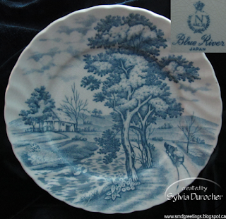
I found another plate in blue and white.  It has the same fluted edge as the Myott/Johnson Brothers ones I have but surprise it was made in Japan.  I was surprised to see the mark.

It will fit in just nicely with the pieces I have and at under a $1 and could not leave it there.


This is the book on my reading shelf this week.  It's is so interesting how our attitude affects how we see the world.

I am working through the preparation to make some changes in my place which is a huge stretch for me. 

I bought cabinets for the kitchen and tools which I have never owned before. Been spending time at hardware stores and Re-Store retail outlets.  Hours of  research on line for flooring, shelf brackets, and soon paint.

Many people have been very supportive. I been hearing "It will be alright"
"We survived and are thrilled with the results and so will you"
"I know a guy who paints, builds, does electrical, etc."

I found this wonderful bottle at the thrift store as well.  Note the name: Doulton.  I did not know they sold perfume. 

The bottle is heavy and very nicely cut to provide the clear and frosted pattern. 

The lid looks like metal until you touch it then you know it's plastic. Very good imitation. 

It will add some class to a photo down the line.  This is my second perfume bottle.  Super happy with this one.

I was working on a photo shoot the other day and I had roses in the vase but it occurred to me that with spring I should have tulips.

A visit to the craft store this week allowed me to bring home 2 picks for the price of one. I bought this bring traditional set and a lighter in pastel colors as well.  Should cover most situation.s

A small Battenburg doily under a crackled glass vase with a few marble in the base.  Taken against a black velvet background.

Works for me!

Sharing with Jann at Daily Cup with Mrs. Olson - Share Your Cup #245.


Monday, April 17, 2017

Mosaic Monday - Blue & White Dinnerware

This is the pattern "The Hunter" that got me started on blue and white dinnerware. I love the color and the scallop pattern in the dish itself.  I have 2 dessert plates but have yet to find any other pieces at prices I am willing to pay.

Myott Staffordshire - The Hunter Blue (No Trim)- 2 dessert plates.

A bit of history:
1898 - Myott, Son & Co. Ltd., an earthenware producing factory operated originally from the Alexander Pottery in Stoke-on-Trent, Staffordshire, in the North of England. It was run by two brothers, Ashley and Sydney Myott.
1949 - A fire took place and the company relocated to the larger Crane Street Pottery in Hanley
1969 - They were taken over by an American corporation Interpace.
1976 saw the company merge with Alfred Meakin Limited to form Myott-Meakin Ltd.
1989 the name Myott-Meakin (Staffordshire) Ltd. was adopted as a result of an acquisition by Melton Modes.
1991 - The name was then lost after the company was taken over by the Churchill Group.
Based on the above I will venture to say that my plates date to the mid 1960s or so.

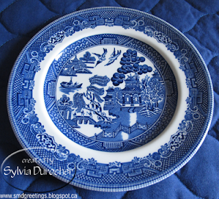
Johnson Brothers - Blue Willow - 2 dessert plates.
This is not my favorite design because it does not have the nice fluted edges of the Myott pieces.  I find the edges thicker and so much to my liking.

The oriental design also is not that appealing to me either.  I bought these early in my collecting. 

I find the blue on these to have purple hue rather than the warm hue on the Myott pieces.


Myott Staffordshire - Chelsea Garden - missing the dinner plate. 

This pattern was made especially made for Bloomingdales.
around the 1970's - 1980's

These have the fluted edges but not as refined as the earlier pieces.  Again the hue leans to the purples rather than the warmer tones.


Staffordshire  - Liberty Blue  - 1 dinner plate
This piece is very similar to the Chelsea Garden set in color, weight and feel.  I likely could use it to complete the set above. Both were made for the American market.
Liberty Blue dinnerware began as a regional promotion by the Benjamin Franklin Federal Savings and Loan Association, a Pacific Northwest financial institution, which was founded in 1925. The company's home office was in Portland, Oregon.
Enoch Wedgwood, in England's historic Staffordshire district, was contracted to create a pattern of blue and white dinnerware featuring historical scenes from American Colonial history. Each form had a different scene. A border featuring a mixture of wildflowers helped unify the set.The association launched the promotion in 1975.
When a subscriber made a new deposit of $50, he received a free four-piece place setting. Additional settings could be purchased.Additional pieces were available for purchase. If a customer deposited $1,000, he could buy a 45-piece set for $45.In October 1976, the association announced it was discontinuing the promotion at the end of the year. After that time, customers could order pieces from the Sigma Marketing Co. of Garden City, N.J.Liberty Blue dinnerware was also offered to grocery stores nationwide for promotional use.The dinnerware disappeared from the scene by the mid-1980s.

J&G Meakin & Johnson Brothers - Blue Nordic - missing 3 saucers to make a 4 place setting.  I have several serving pieces as well.

This is the pattern of which I have the most pieces because my aunt gave me most of them. Blue Nordic.  I have some pieces from each vintage.  I love the scallop edge of this dinnerware.
The coffee pot is very similar but not made in England so is a different vintage.  I have found photos of the coffee pot that matches and of course it has those favorite flutes in the design.

Blue Onion is a fine porcelain tableware pattern for dishware originally manufactured by Meissen porcelain since the 18th century, but copied by other companies since the late 19th century as well. The onion pattern was designed as a white ware decorated with cobalt blue underglaze pattern.
Meakin J and G  Pattern:Blue Nordic  c1960s 1964  Blue and white stylized floral. Classic shape
Blue Nordic by Johnson Brothers was produced from 1979 to 1996.

Countryside by Wedgwood & Co. I have a full place setting.
Each piece has a different scene on it which makes it interesting. 

With a bit of research on the web this pattern dates back to the 1960s as well.
Ebay Factoid: However, there is another company, Enoch Wedgwood of Tunstall.  Their logo often includes a unicorn and regularly pieces are marked as Wedgewood & Co.  This is NOT WEDGWOOD and has little to no value.  Often making standard dinnerware or collectibles for Avon, only buy these pieces if you love them as they have almost no collector value.  I like so I am good.

I`ve given myself an education about blue and white dinnerware and hopefully you will find it helpful as well.


Sharing with Maggie at Normandy Life who hosts Mosaic Monday #36.


Sunday, April 16, 2017

Share Your Cup - This Week

I added a glass red apple to my collection of glass fruit in my table center piece.  I find amazing how when you start looking for certain things you find them.  Was I walking passed them before?  Likely.

You can see my bowl of fruit here.


I had put a small LED light on my shopping list.  Sometimes when I am doing photography I need some in fill lighting.  The 100 and 60 watt lights I have for the house are too much.  I wanted it with a magnet or clip so I could position it as needed.  This one as a flexible arm as well so I am good to go!

It is a Merangue Crookneck 3-LED Bulb Book Worm Light worth over $10 new and at the rummage sale on the weekend the price was .50 with a set of batteries. It's uses AA batteries so I can use my regular rechargeable AA batteries.

I've used it already and it works well.


I have purchased a 100% polyester shower curtain liner to replace the PVC liner I had been using.  I found out that PVC is toxic and bad for you.  My sister indicated she used a 100% polyester one which gets laundered regularly.  Well, that makes sense!
I have always used a clear plastic liner and a sheer outside curtain so I can see when I am in the shower.  I was concerned a white polyester one would make it too dark.  Well it doesn't. 
Some curtains have weights in the hem to keep it from flopping around and letting water on your floor.  This one did not so I just DIYed a solution.  I sewed 3 little pockets and placed stainless steel washers in them.  The washers don't rust and I left the top open so I can just removed them to wash the curtain.
I bought new hooks as well which make it easier to remove the liner to wash it.  I've had a burgundy outside curtain for a long time.  After the experience with the kitchen cupboards, I decided to replace the dark one with a lighter one.  I love this one.  It is elegant, sheer, and helps make the room much brighter.
Sharing with Jann at Daily Cup with Mrs. Olson who hosts Share Your Cup #244

Happy Easter


Wishing all a very Happy Easter!  Our family plans have been changed due to the big storm that went through the north east starting on Thursday.  We have had some with 18 inches of snow, no power, and unpassable roads.  We can celebrate another day.

Thursday, April 13, 2017

Blue Green Mom's Day

I made this card to help out my sister who needs Mother's Day card for sale next weekend.
I started with the watercolor piece.  I simply wet the paper and use my water brush to drop color onto it. I started with the blue then added the green for the leaves.
Once dry, I trimmed the piece.  I wrapped a turquoise string on the left and tied it with a bow.
I added a clear embossed black greeting on vellum across the top and taped the ends to the back.
I chose a piece of turquoise card stock and press embossed it with a Provocraft with leaves in opposite corners. I just embossed the right hand side.  I adhered this layer to the front of a green card. 

Wednesday, April 12, 2017

Easter Tea


I lit a tea light candle in this wonderful rabbit glass tea light holder.  I don't have a lot of seasonal decor so on my trip to the library yesterday I stopped to see what was up at the local thrift store. 

After a bit of research it was sold by Hallmark in the early 70s.  It is quite heavy and very smooth. Some on-line are refering to it as crystal. Maybe, certainly has that feel.

He won't take a lot of space and he can come each Easter.

I am quite happy to have scored 4 of these tea cups yesterday at the thrift store. I love the blue and white classic design set on a navy table cloth and a white placemat.

I now only need 3 saucers to have a table setting of four of Blue Nordic by Johnson Brothers.  Dinner plates, dessert/salad plates, saucers and tea cups.  I have a platter as well.

Today, I am having Spicy Chai tea with some honey and cream. 


I set the table with a vase of pink roses.  They are held in a small crackle glass vase with a few glass marbles in the bottom to hide the end of the stems.  I placed the vase on a small round Batternburg lace doily.

I should have had tulips!!  Why did I not think of that?  I will have to put those on my shopping list. 


I used my large white porcelain tea pot today.  It will serve me about three servings of tea.  The brand of this one is a department store brand - PC. I am amazed how much lighter porcelain is to stoneware.  I have a couple of each and gravitate to the lighter one usually. 

I Battenburg lace napkin in a crystal napkin holder. 


This is the full view of tea this afternoon.  It included a few sweets.  A bit of chocolate cookie, an oatmeal and a citrus cranberry cookie. Wishing you a Happy Easter.

Sharing with the following:

Ruth at Tuesday Cuppa Tea

Bernideeen at Tea with Friends


Monday, April 10, 2017

Art Card Stack Class

I am holding my Art Card Stack Class tonight and these are the cards we are making.  This is a very different from the kind of cards I usually make.  I had hoped that by offering something different it would be more popular and I would be able to capitalize on the trend of adult coloring books. Did not turn out that way.  I have a few ladies registered.

I will be bringing a couple sets of pencil crayons, and water color pencils with brushes.

I have 2 ladies who purchased the Stampin Up Watercolor Crayons years ago and would like to learn how to use them with the Aqua Painter (water brush) which was sold at the same time. We will use a clear mount for our palette.  I am looking forward to helping these ladies make use of the supplies they have.  I also have these supplies which I have not used a lot so we will have fun together.

These line drawings are printed on heavy card stock.  The designs are by Joanne Fink. She is an Orlando based calligrapher/designer.

I chose to mount them onto black card bases so no matter what color the participants chose it would match the black outlines in the art.  I wanted to add greetings but without hiding the wonderful art so I chose vellum as a substrate.  Again, with black letters clear embossed on the vellum so it all matches and does not conflict with any colors selected.  All held in place with tiny black brads.
My 2 Cents:
As a person who has spent the better part of the last 20 years working on cards, teaching classes, and in many involved in this craft I am disppointed in the lack of appreciation for them in the younger crowd.  I know that when the postage increased in our area a few years ago that was the final straw for some who just abandoned the practice completely.

Cards are not popular among the younger crowd and the older crowd struggles with the motor dexterity to handle the materials and tools. I, one day will no longer have people who will participate.  I am sad about that but that is for a day way in the future I hope. 

I was speaking to a young lady yesterday and she was not interested as she does not send cards at all.  I guess it's all on line or not done at all.


Laurentien pencil crayons - the brand I used when I was in elementary school. Can be applied light or heavy. Soft or bold are options.


Artist's Loft - Watercolor Crayons which are applied like pencil crayons then lightly moistened with a paint brush to blend the color(s) and fill in the white spaces.


Stampin Up Watercolor Crayons. They are solid color pencils so there is enough color in this box for me to paint the rest of my life and likely beyond that.  These are available under other brands.


A spray bottle to provide a bit of moisture when needed.  The Aqua Painter brush from Stampin Up.

I am looking forward to the class and sharing my knowledge and giving these ladies the ability to leave my class and continue to make art and cards.